


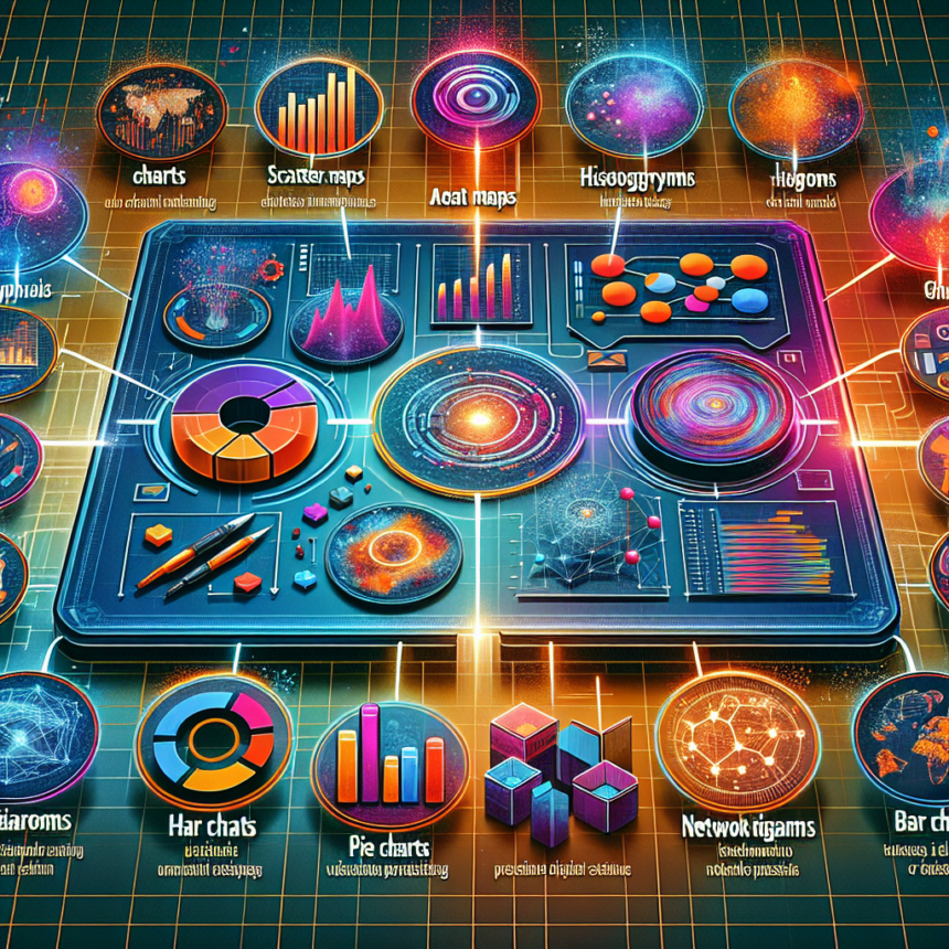
In the age of information overload, effective data visualization has become essential for making complex data understandable. Whether for business reports, academic presentations, or strategic meetings, the right visualization tool can turn data into insights. Here’s a look at the top 10 data visualization tools in 2023 that can help create stunning presentations.
1. Tableau
Tableau remains a leader in data visualization due to its robust capability to handle large data sets while providing interactive dashboards. Users can build different visualizations quickly and share them across platforms. Tableau’s intuitive drag-and-drop interface allows both beginners and experts to create stunning visuals.
2. Power BI
Microsoft Power BI stands out for its seamless integration with other Microsoft products. It’s designed for transforming raw data into meaningful information through a user-friendly interface. Power BI offers advanced analytics and machine learning features, making it a favorite for corporate environments where business intelligence is critical.
3. Qlik Sense
Qlik Sense is renowned for its associative data modeling, which allows users to explore data freely instead of following a linear path. This tool empowers users to create visualizations that provide context and comprehensibility. The self-service capability enables non-technical users to generate insights effortlessly.
4. Google Data Studio
For those seeking a free and collaborative tool, Google Data Studio is a standout option. It allows users to create customizable dashboards that pull data from various Google services and other third-party sources. Its sharing capabilities encourage collaboration, making it ideal for teams needing real-time data input.
5. D3.js
D3.js empowers developers to create customized graphics and interactive visualizations using web standards. This JavaScript library is highly versatile and is often used for complex data sets. Although it requires programming skills, the results can be breathtaking and are well worth the effort for those looking to push the boundaries of traditional charts.
6. Infogram
For non-technical users, Infogram offers an intuitive interface to create infographics, reports, and social media visuals. Its library of templates and graphic assets allows users to craft visually appealing content quickly. Infogram also provides interactive elements, enhancing user engagement.
7. Plotly
Plotly is another powerful tool built for data science enthusiasts. It offers sophisticated visualization capabilities, particularly for those working with Python and R languages. The integration of code and visualization allows data scientists to explore and convert complex data into meaningful visual insights seamlessly.
8. Canva
While primarily known for graphic design, Canva has made significant strides in data visualization. With numerous templates and simple drag-and-drop functionalities, users can create eye-catching presentations that incorporate graphs, charts, and data points easily. This tool is ideal for marketers and educators looking to balance aesthetics with data.
9. Chart.js
Chart.js is a simple yet flexible JavaScript library for building charts and graphs directly on websites. It’s perfect for developers looking for a lightweight solution that allows for quick data visualization integration without heavy reliance on libraries. Its focus on simplicity and quality has made it popular for real-time data displays.
10. Microsoft Excel
While often overlooked, Microsoft Excel remains one of the most powerful data visualization tools available, especially for beginners. With its myriad of built-in charts, graphs, and pivot tables, Excel can turn raw numbers into insightful visuals. Its familiarity also makes it a go-to tool for many professionals.
FAQs
Q1: What should I look for in a data visualization tool?
A1: Key considerations include user-friendliness, integration capabilities, cost, flexibility of design, and the ability to handle large datasets. Also, consider whether the tool allows for collaboration and sharing.
Q2: Are these tools suitable for beginners?
A2: Absolutely! Many of these tools offer free versions or trials, including helpful tutorials that cater to beginners, enabling them to learn and build effective visualizations.
Q3: How do I choose the right tool for my needs?
A3: Assess the types of data you are working with and the kind of visualizations you want to create. For example, if you need static infographics, tools like Infogram or Canva are ideal. For interactive dashboards, consider Tableau or Power BI.
Q4: Can I use these tools for real-time data visualization?
A4: Yes, several tools like Power BI, Google Data Studio, and even D3.js can be used effectively for real-time data visualization, provided they are connected to live data sources.
Q5: Are there any free alternatives among these tools?
A5: Tools like Google Data Studio and Canva offer robust free versions, making them excellent choices for budget-conscious users. Additionally, Chart.js and D3.js are open-source libraries, allowing free access without licensing fees.
By leveraging these top 10 data visualization tools, you can create compelling presentations that not only display data but also tell a story. Whether you’re a seasoned analyst or a beginner looking to enhance your presentation skills, these tools will help you make a lasting impact.